

How to Use Colour Psychology to Promote Your Business
You instinctively know that colour is important in pretty much anything we do, it’s why we spend so much time mixing and matching our outfits, looking at colour palettes when redecorating our homes, you name it, colour is somehow involved.
But it goes beyond one colour looking nicer and the other. Colour goes deep into our psychology, underpinning our behaviours and even purchasing decisions. It’s why companies spend millions of dollars figuring out what works best in any given scenario, from rebrands to marketing campaigns.
In this guide, we’ll give you a rundown on how you can implement colour in your printed marketing materials for maximum impact. It’s not as simple as green is healthy and red is bold. It goes a little bit deeper than that.
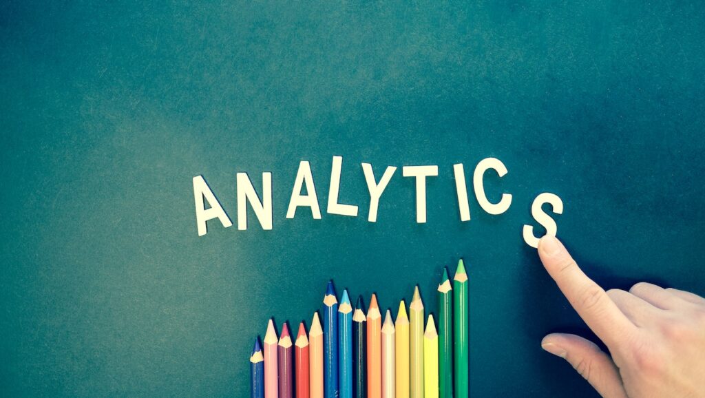
But Wait, What is Color Psychology?
Before we delve deeper into the practical how-to aspects, let’s put a definition to colour psychology. In simple terms, it’s the way colours and even hues/tones can affect how people perceive and interact.
When it comes to marketing, colour impacts brand impressions, from how we perceive the business to making purchase decisions. It’s not a small deal; in one study, colour can account for up to 90% of snap decisions on products and brands. Compare that to texture, which accounts for just 6% of the buying decision, and sounds/smell, which make up a tiny 1%.

Understand Perceived Appropriateness
Consumers expect Coca-Cola to be red. Woolworths is green. Twitter is blue (oh, wait, is it?). In a study from 2006, researchers found that people have a sense of perceived appropriateness when it comes to brands.
When you choose a colour for your marketing campaign, consider whether it actually fits your brand. Take it further and collect some third-party feedback on whether the colour is appropriate for the campaign itself. If you’re running a sale, you’re going to want a different colour palette than when selling a luxury vacation.
What’s the Emotional Response?
When you send out marketing materials, there’s a design behind it, right? You want to elicit a certain response, whether it’s curiosity, confidence or the scarcity effect.
Decide where you’re going with your campaign before looking for a colour palette. Business owners often make the mistake of simply choosing colours they like, rather than picking based on the emotional response we’re seeking from our target audience.
Mimic Other Brands
We’ve already mentioned that the big hitters in all industries put in a lot of Research and Development funds into the psychology of colour. They know how important colour is to their bottom line, which means you can leverage their conclusions into your own local marketing efforts.
When you next get something in the post from a major corporation, analyse why they may be using one colour over the other. What are they trying to achieve with their marketing? How do the colours fit with the overall brand?
Understand Different Colors
Every colour can have a potential meaning, depending on the context and brand. We’re not going to go through every single colour out there, but here are some general guidelines for some of the most popular ones:
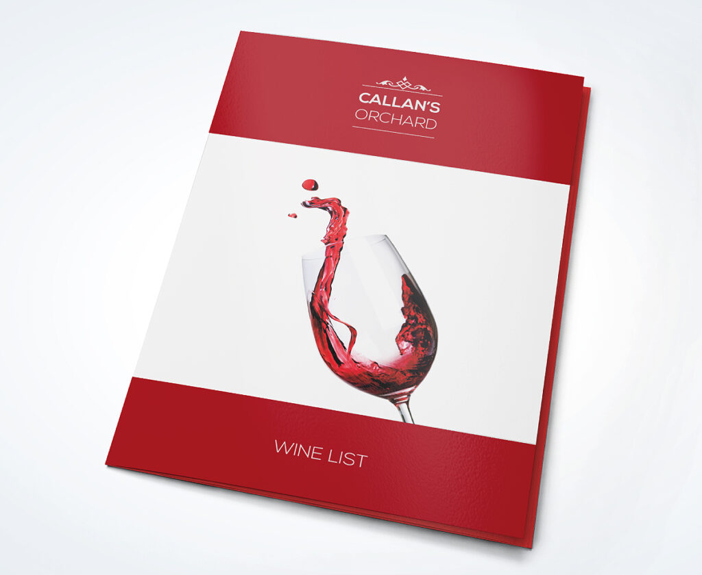
RED
This one tends to be used when seeking an impulsive response, as red tends to evoke a strong emotional response, passionate and intense. Studies even show that red can increase your heart rate!
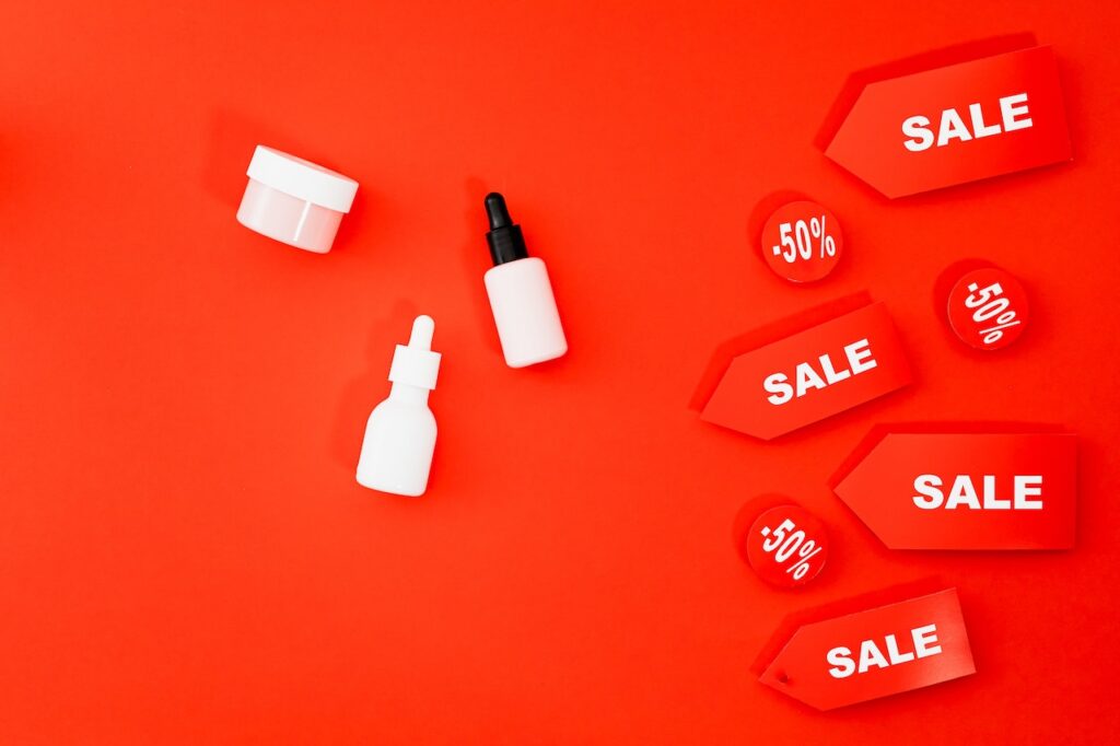
This is why it’s often used for big sales. People will see the big red signs, excitement goes up, stimulates our senses, and consumers then load up their shopping carts.
YELLOW
This is the colour that you’ve probably had the longest ‘relationship’ with. This is because yellow is the very first colour that infants respond to, which is why it’s always used with toys and baby products. Yellow also causes our mental processes to be stimulated, heightening communication, and grabbing attention.

Careful, however. Research has also shown that too much yellow can have adverse effects, causing anxiety in shoppers. Remember the old adage, A little goes a long way.
GREEN
When it comes to health brands, green is often the colour of choice. This is because there is such a close connection between nature and green, which is also why so many eco-friendly brands see this colour as their go-to.
BLACK
Sophisticated, powerful, sleek black exudes all of these emotions in shoppers. It’s why high-end cosmetics and fashion brands use this colour all the time.
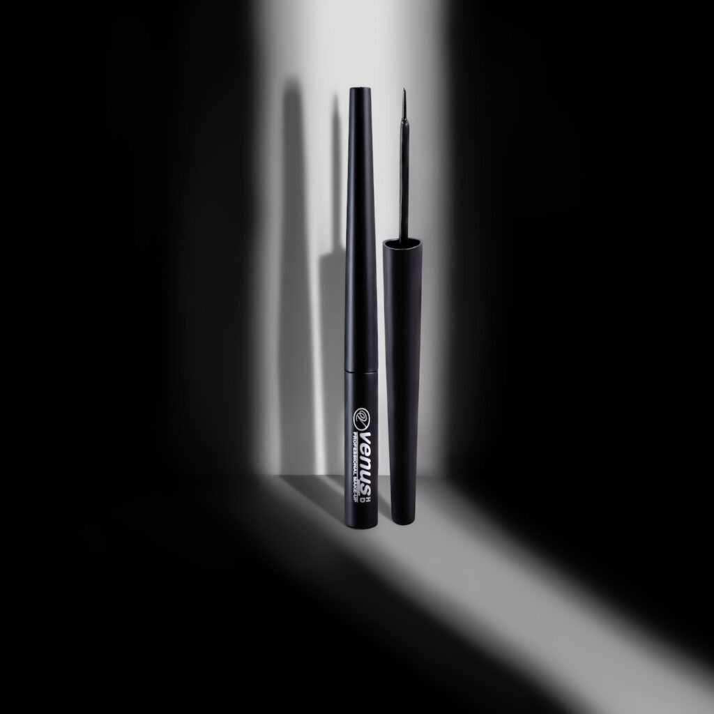
It is also one of the few colours that have a universal meaning and interpretation, which is why many multinational brands will use it in their marketing. Think of brands like Adidas and Gucci, for example.
Final Thoughts
When it comes to your printed marketing materials, everything counts. Whether it’s the type of material used, the texture, the text and the images. But if you choose the wrong colour combinations, the effect may change completely. Knowing what you know now, though, you can use this to your advantage!